![Diane Poremsky [Outlook MVP]](http://www.outlook-tips.net/images/2014/MVP_BlueOnly.png)
Many users have a hard time seeing the account names in the Navigation pane folder list – regardless of the Office theme, the font is too small and lacks contrast to read it easily.
Brad had this to say
It's very difficult to see the names of my Inboxes in Outlook 2010. I found an option under the General tab to change the color scheme to blue, silver or black. In all of the themes, the name beside each inbox seems to be grayed out. I have to take my glasses off and squint at the screen in order to make out which is which. Is there any way to make these names a more sensible black?
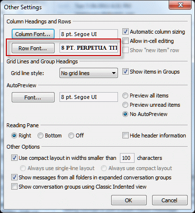
Unfortunately, no, you can't make it a more sensible black or a darker gray. THe best you can do is to change the font used for the folders. While the text will still be gray, the larger letters make it easier to read.
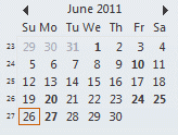
Default font (8 pt):

Using a slightly larger font in the Navigation pane (10 pt):

To change the font, switch to the View ribbon and expand the Navigation pane menu. Choose Options, then Font and select the desired font and font attributes. Switching to 10 or 11 point font or choosing a font with larger, bolder strokes may be enough to reduce eye strain.

Published October 17, 2011. Last updated on February 13, 2013.